Picking out paint colors for a new home can be overwhelming. I find that many times when I meet with a new client the entire house is simply just painted white or a light gray. Now, I think there is a time and place for those colors, but with paint, there is just so much more that can be done! Truth be told picking out a white or something in the gray family can be some of the hardest colors to get correct so, if you want to make it easier on yourself, it’s actually better to go with an actual color! Now, here is where I’m going to blow your minds! Most colors can be used as a neutral. There, I said it! It’s really true! However, what is neutral to one person may not be neutral to another. So, how do you figure out what your neutrals are?
HOW TO PICK OUT PAINT COLORS FOR YOUR HOME!
First step: If you are picking out paint colors with a significant other or roommate you need to both be on board with the idea of using color. It’s also good to get over those notions that certain colors are for certain genders. It just isn’t true. I have met many women that hate the color pink and men that are totally happy using it in their homes. If everything else is done right and it all comes together then what does it matter!
Second step: Take a good look around your closet. What colors are you drawn to when you shop for clothes. I find that since clothing is at a lesser price point than an expensive sofa people are more open to letting colors dictate their closets and step away from neutral everything. Of course, if that is your aesthetic I’m not sure what you are doing here, but welcome. When working with clients I always like to take note of their closets because it helps me see where they are comfortable. In doing this small exercise you get to see where you are comfortable colorwise. Maybe you see that you have lots of shades of blue or simply have a love for the color navy. All good paint color choices!
Third step: Take inventory of your home decor accessories and artwork. We buy what we love and when I started to look around the pieces I had in my own home I saw some common themes. I love citron and shades of pink. All throughout my artwork I kept finding peeks of citron and I realized, “Oh wow, I actually love citron!” I had never declared it a favorite color of mine because in my eyes and in my home it works as a neutral. It’s a common background color that helps tie my home together as a cohesive space.
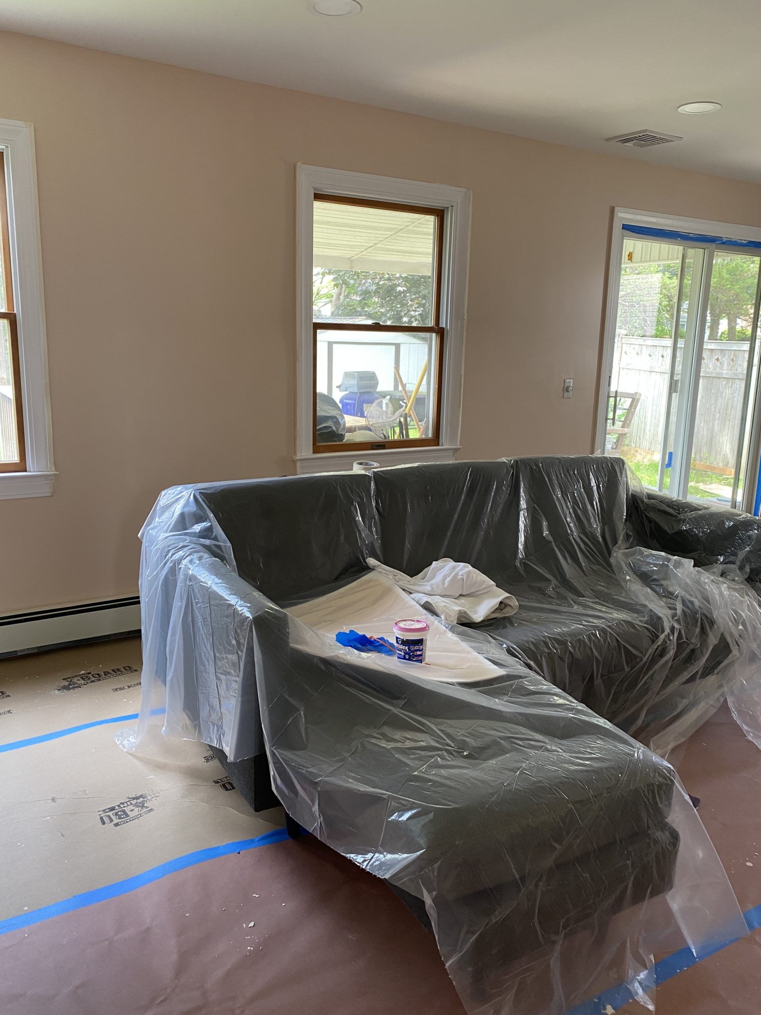
So when it came time to pick out the colors for my own home I took my own advice (Steps 1, 2, and 3) and picked out my favorite paint colors and didn’t second guess myself! In living rooms, my go-to color is typically something in the light pink/peach color family. It reminds me of flesh which is neutral! Is flesh an awful word, yes totally, but it’s a super pretty neutral where you can add in whatever other colors or patterns you like. Seriously there is no color that doesn’t pair nicely with it.
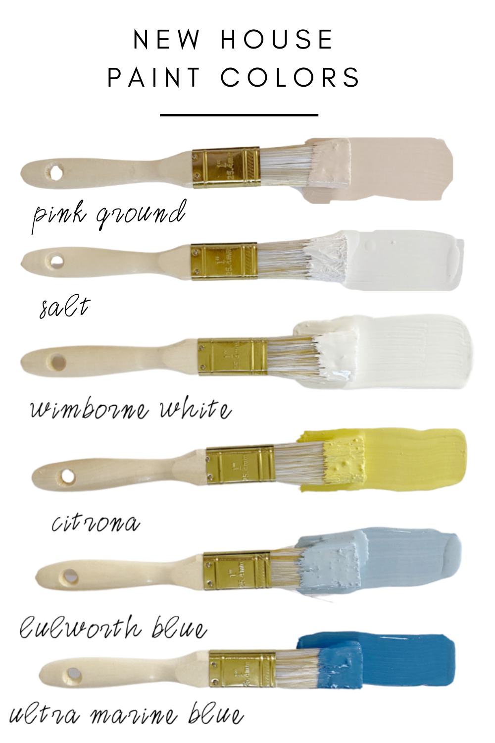
We went with Pink Ground by Farrow & Ball which is a perfect shade of pink meets peach. Depending on the sunlight it will either lean more pink or more peach. It’s not a pale color so it’s not going to come off pastel or babyish and it has wonderful warm undertones that make for a great base in any room.
Room in progress:
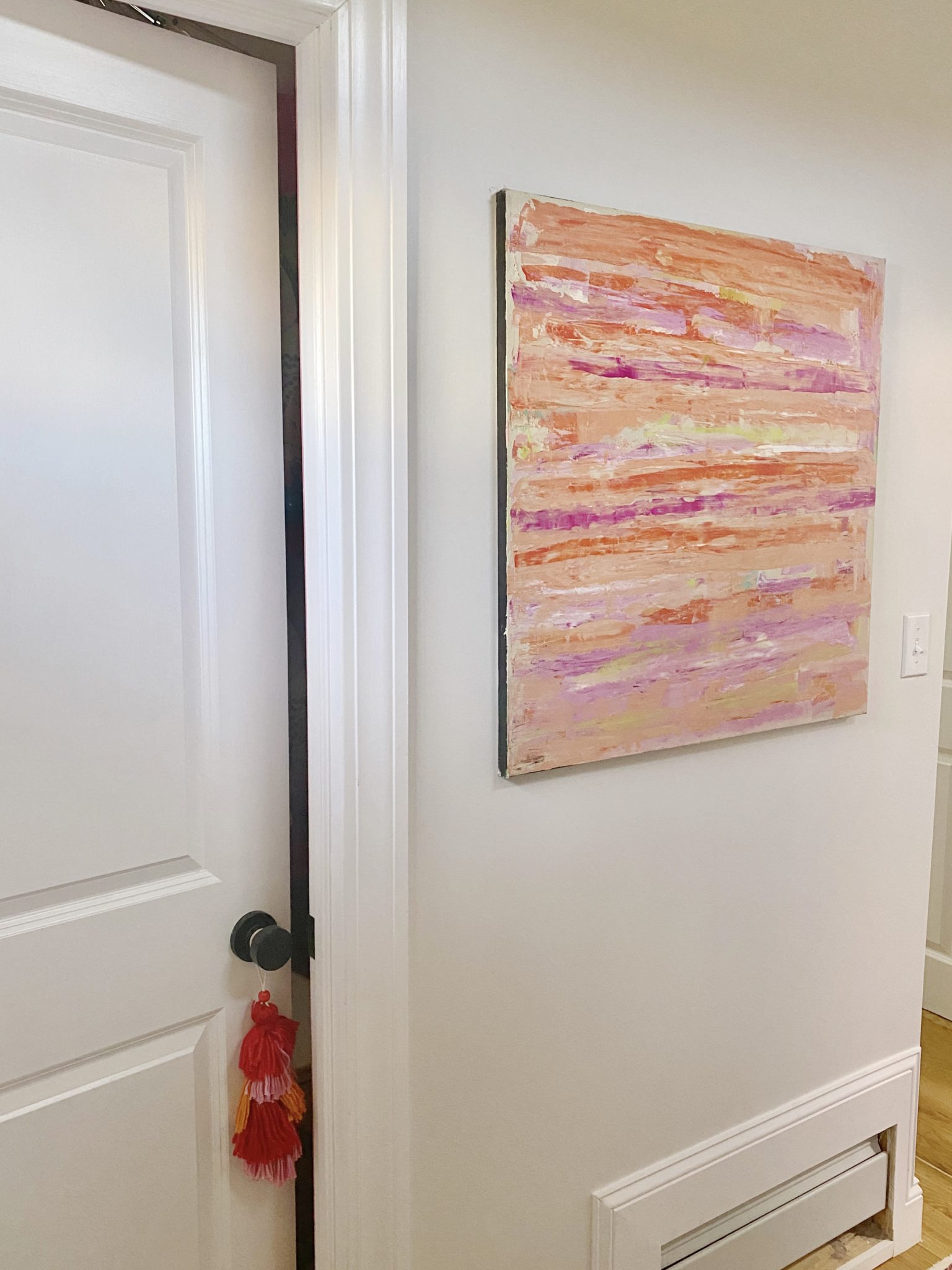
For the hallways on the first floor of the house, I did want to use a more traditional neutral because I didn’t want it to feel like my house was a box of crayons. I went with Salt by Farrow & Ball because it was a beautiful shade of white that wasn’t a stark white. It has this putty hue to it that really made me fall in love with it. Honestly, also just how nail polish names sway me the name Salt and the description of it being an ode to the salt the Pacific Ocean leaves on the beach had me hook, line and sinker.
Room in progress:
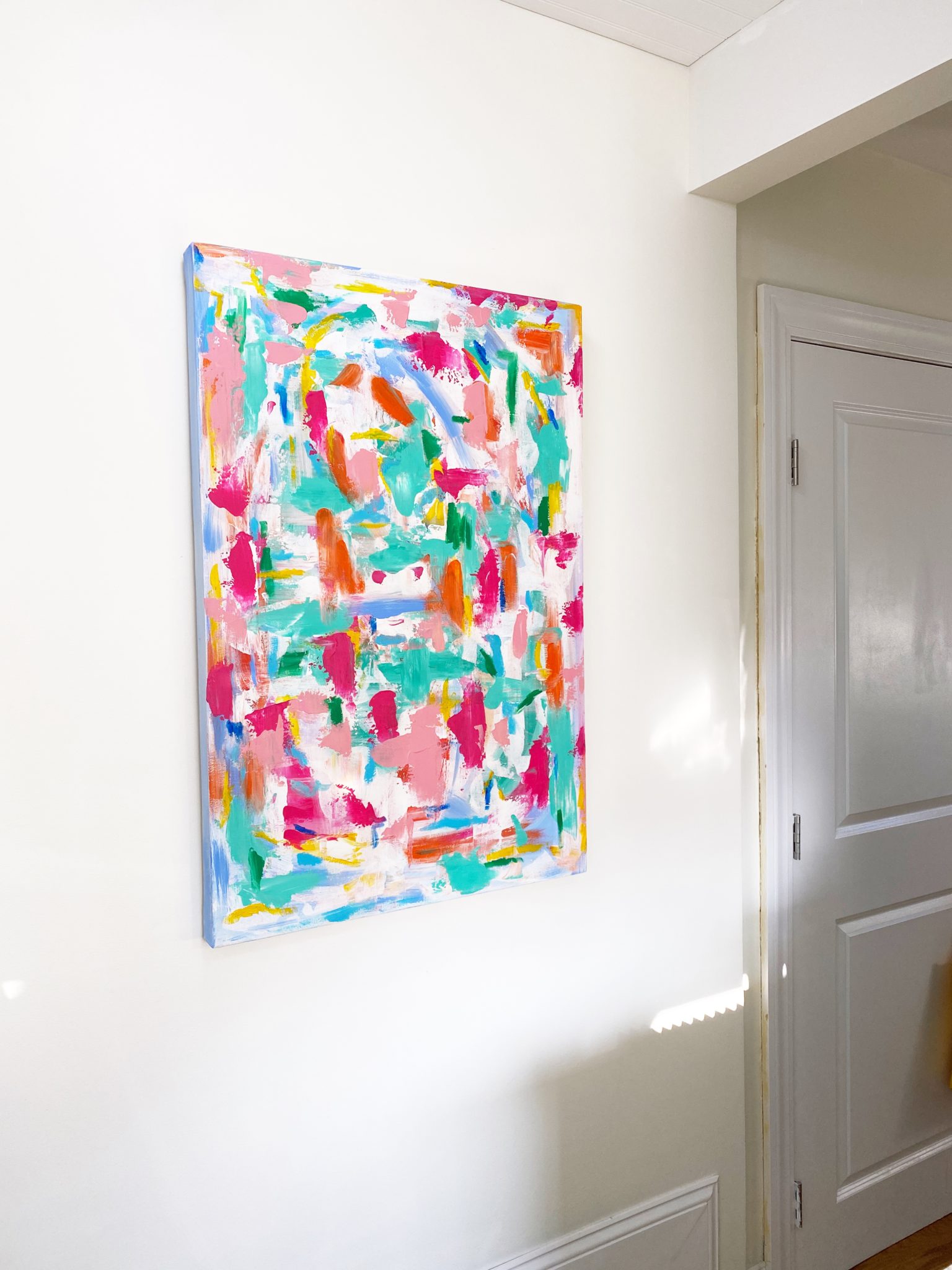
For our kitchen, we have bold cabinetry so I wanted everything else to be classic looking, and loved the warmth of Wimborne White by Farrow & Ball. It reminds me of melted vanilla Haagan Daz ice cream and I find it completely comforting.
Room in progress:
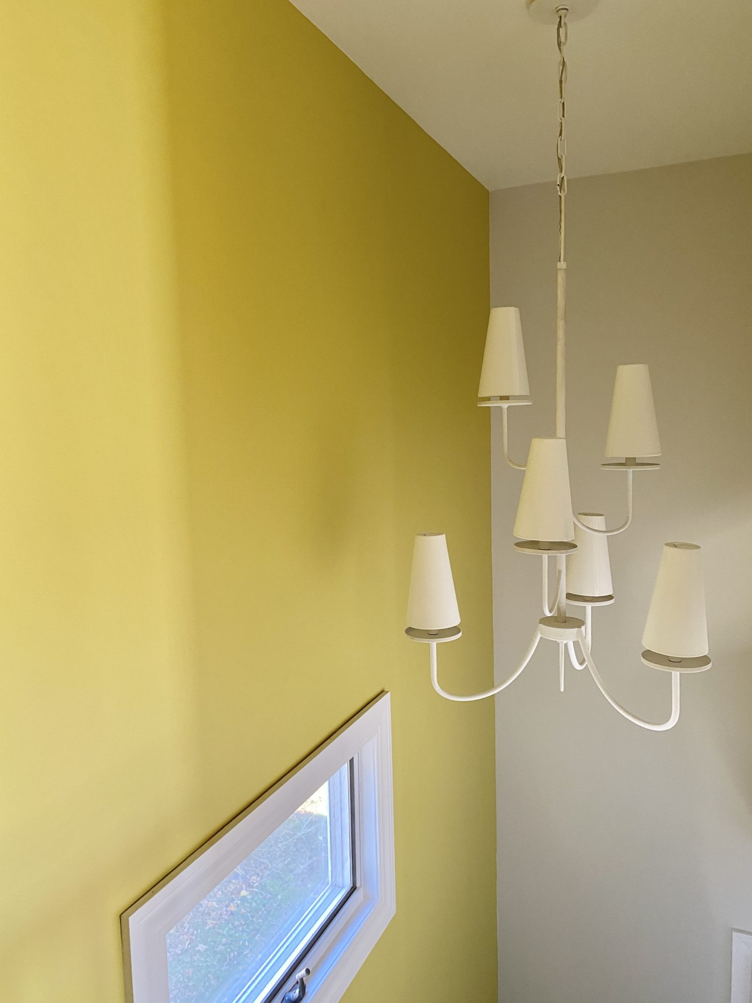
For the staircase heading to the second level, I decided to go big or go home! I went with Citrona by Farrow & Ball. It is the first wall people really see when they walk in and everyone loves it. They are also all stunned that they actually like it and feel like they could never be as brave, but they love it. Be brave! It’s just paint.
Room in progress:
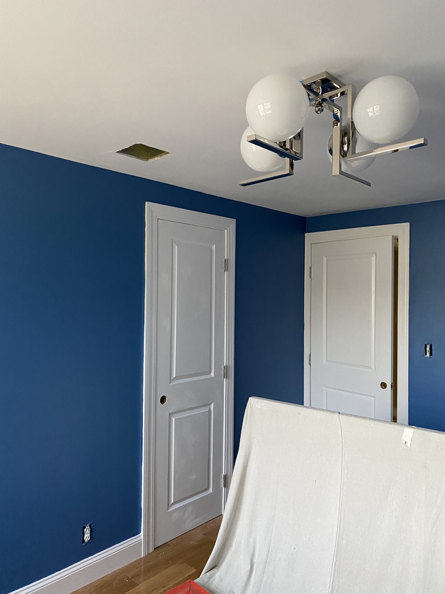
For the boys’ room, they both agreed that they wanted something blue, but they are still little and navy felt too serious. They picked out Ultra Marine Blue by Farrow & Ball. It is an intense blue but it’s also totally jaw-dropping! It works so nicely with their beds and all of the artwork I had picked out for the space.
Room in progress:
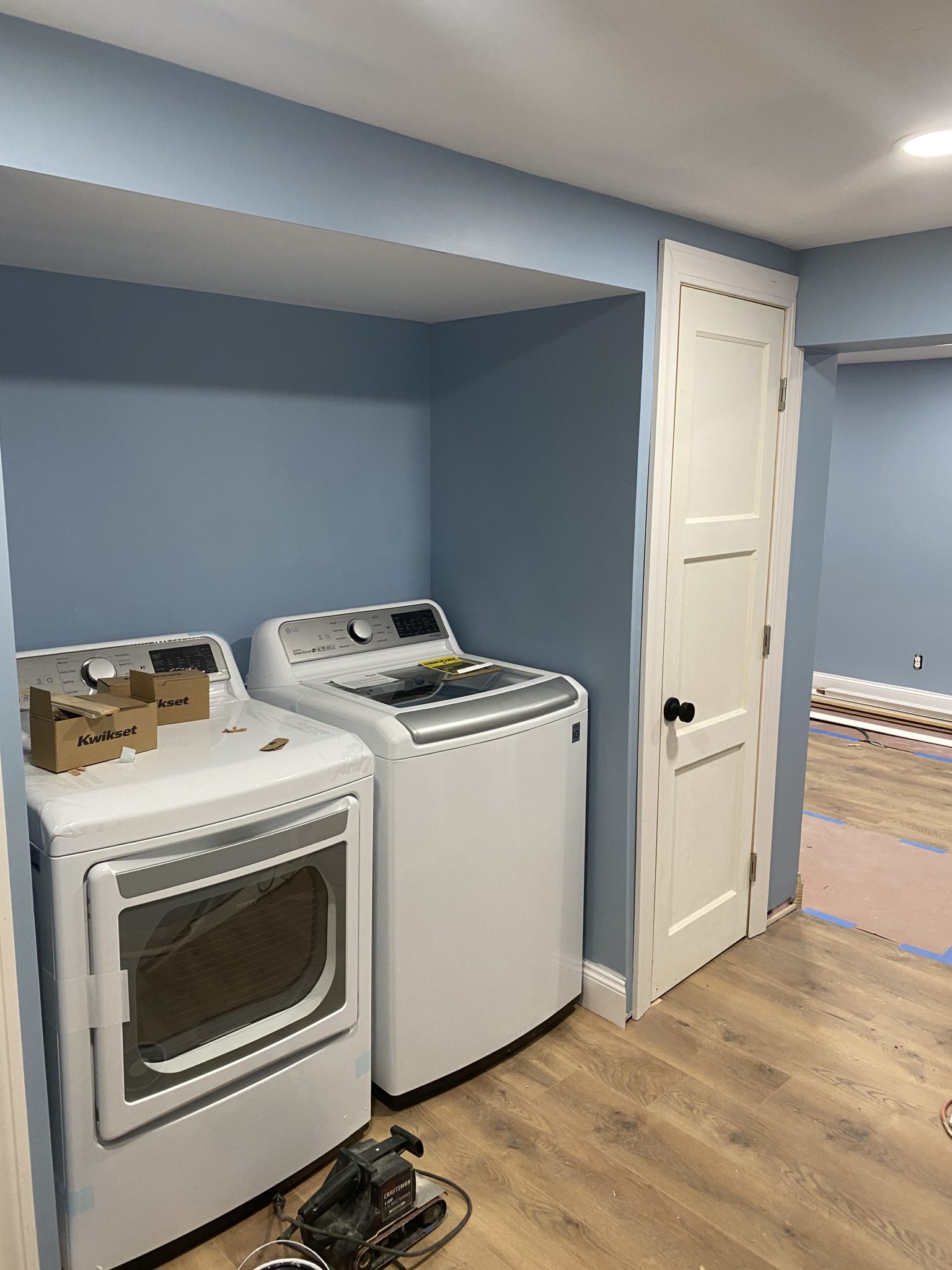
The last room that we painted is the family room. Our family room is in our basement and I didn’t want it to feel like a basement. I wanted it to feel like an additional level of the house that got just as much love as the rest of the house. A fun space that everyone wanted to hang out in. For this room, I knew I wanted to go bold with the sectional and ended up with a green apple velvet! What color goes best with green? Well, blue does! So I set my eyes on Lulworth Blue by Farrow & Ball which reminds me of that pretty french blue or cornflower blue that I keep seeing pop up everywhere.
Room in progress:
Cheat sheet for all of the new paint colors in our home.


